↓

TEAM
OVERVIEW
Throughout the Yamaha ecosystem, individual business units historically had different data collection processes, sources, and infrastructure - resulting in a disjointed and confusing experience for users across Yamaha sites.
CHALLENGE
There was a need to define how individual business units could operate within the One Yamaha digital ecosystem, all while maintaining their individuality and flexibility.
OUTCOME
Unified Yamaha brands under one platform
Bespoke design system
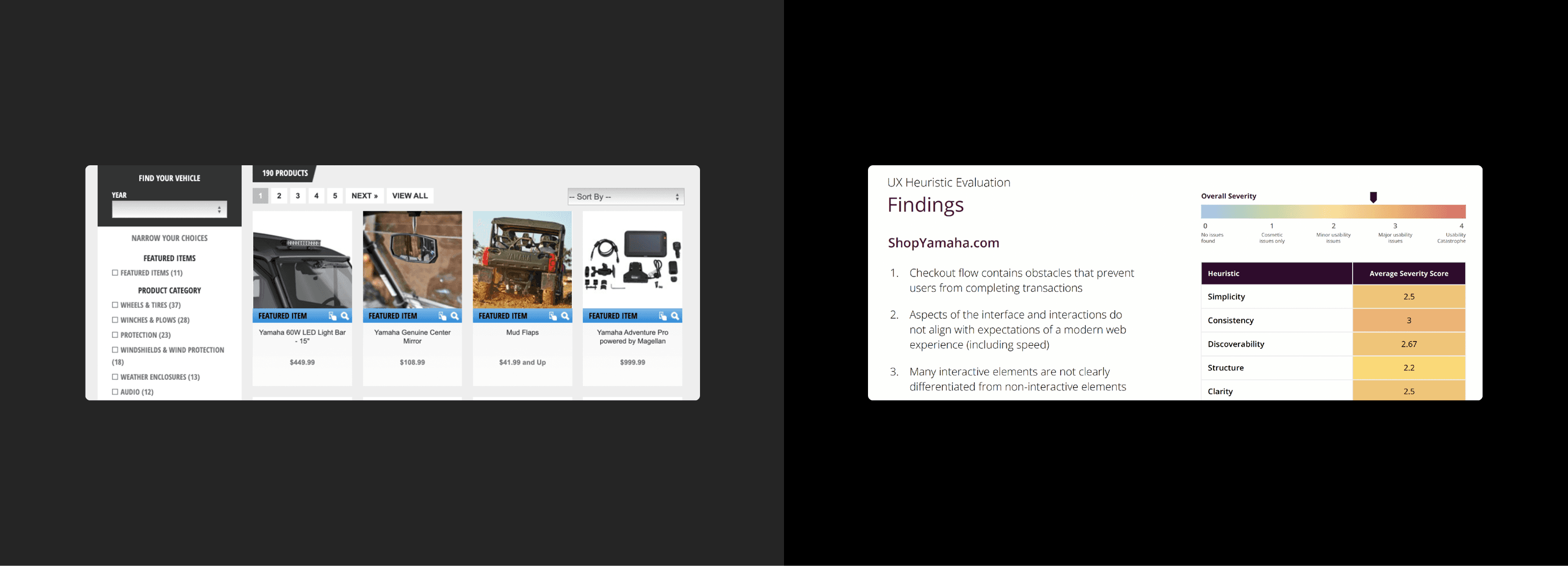
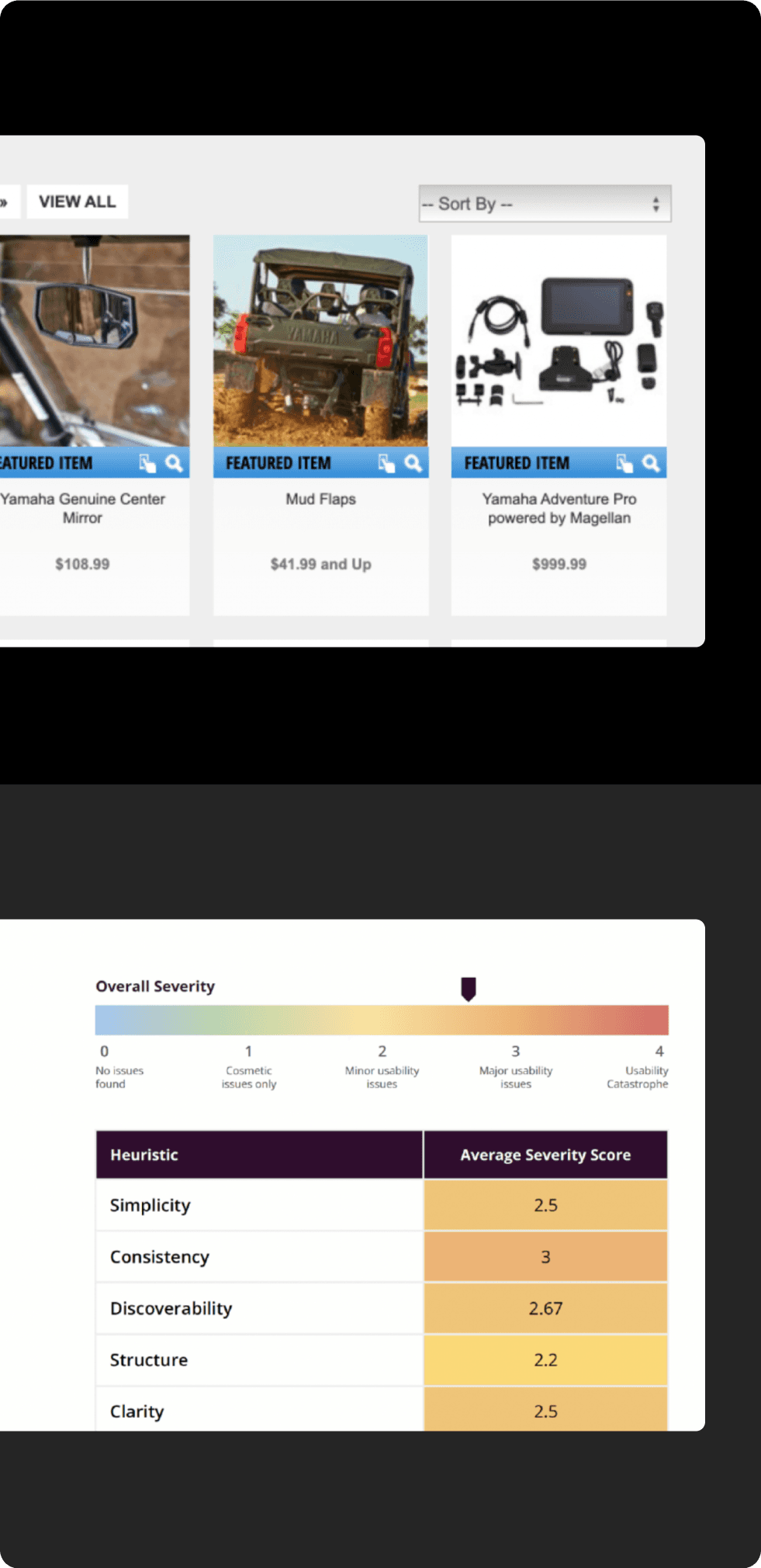
Heuristic Analysis & Site Audit
Brand guideline

Phase 1 _ Discovery
Heuristics testing
UX/UI Audit
Competitive Analysis
User Interviews
Stakeholder Workshops
Roadmap Creation
Phase 2 _ Foundation
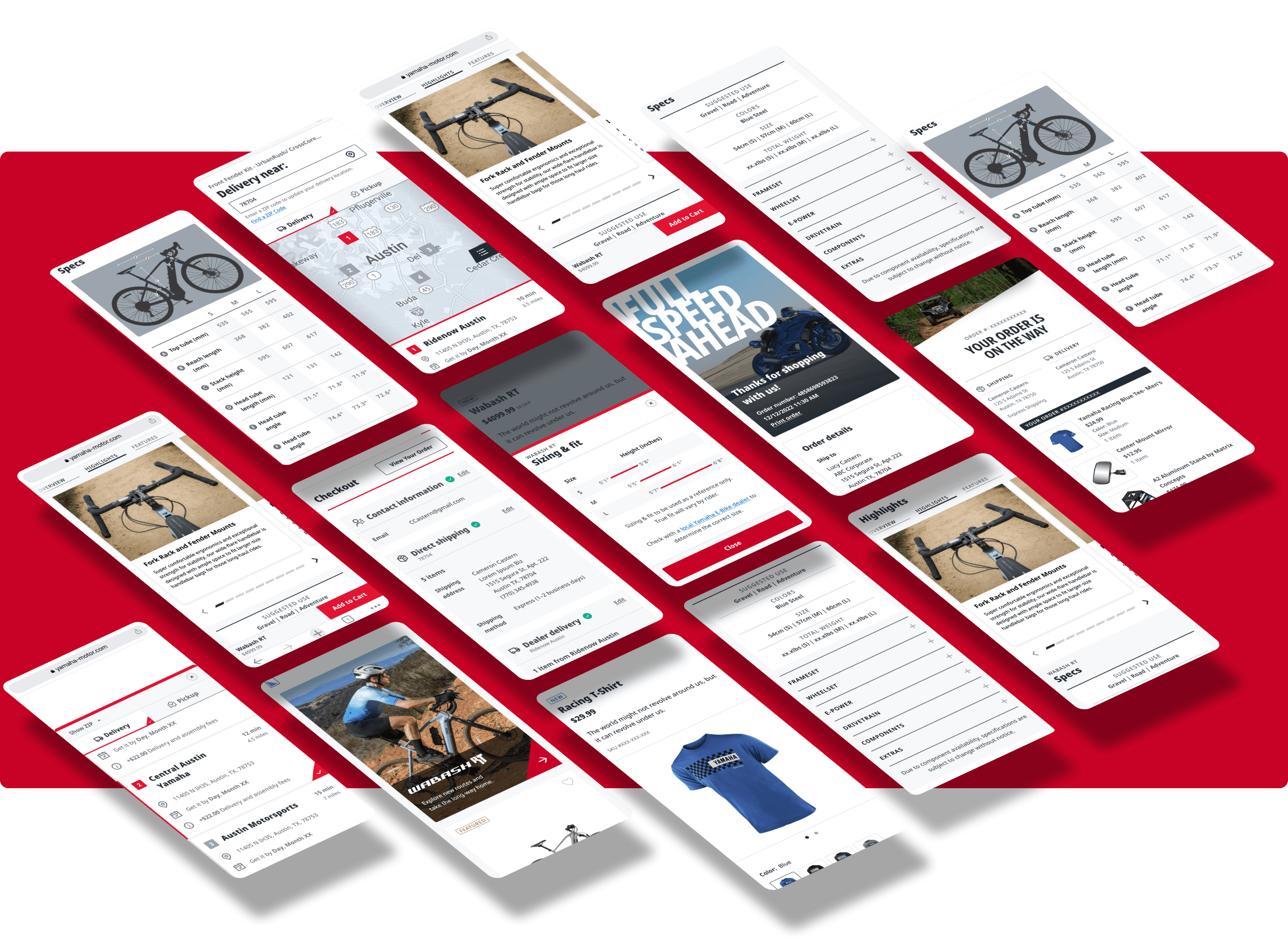
Navigation + Site structure
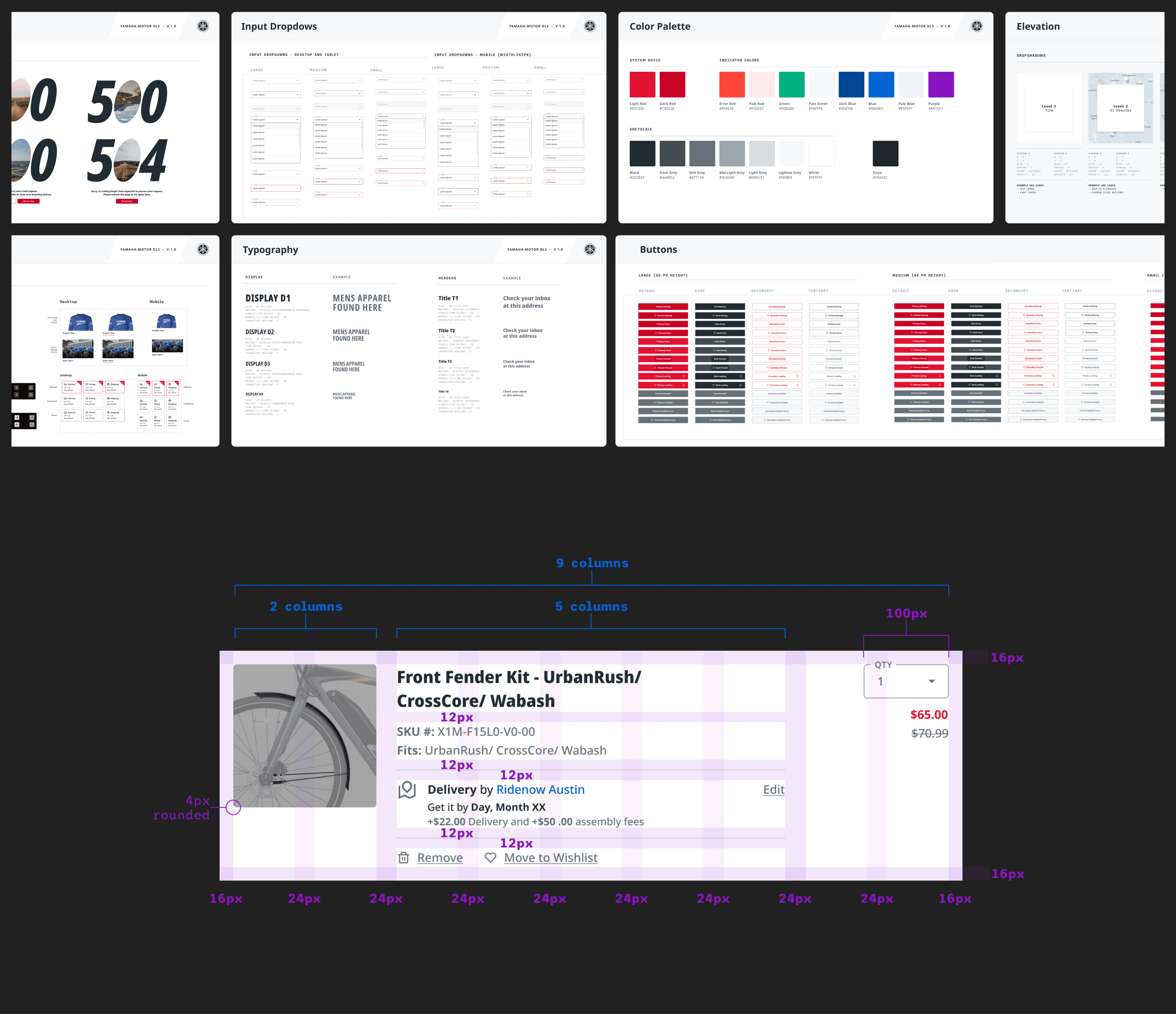
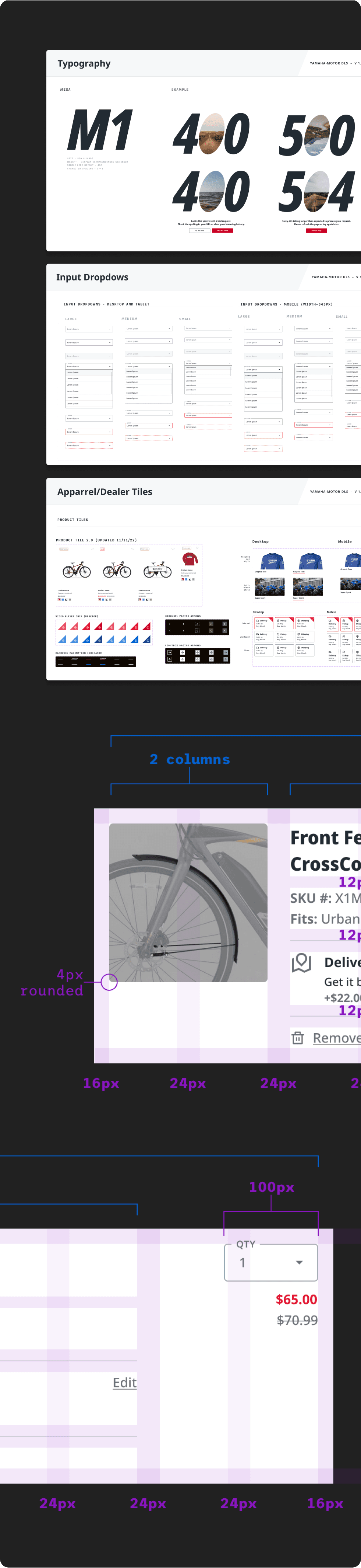
Forming the Design Language System
Account creation / login flow
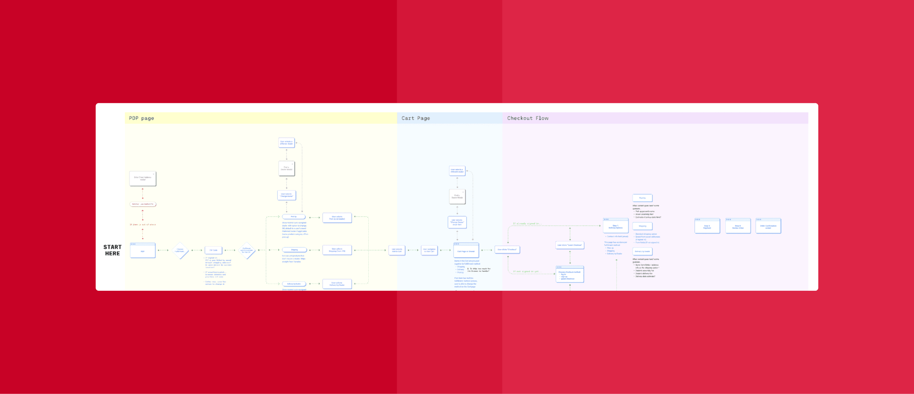
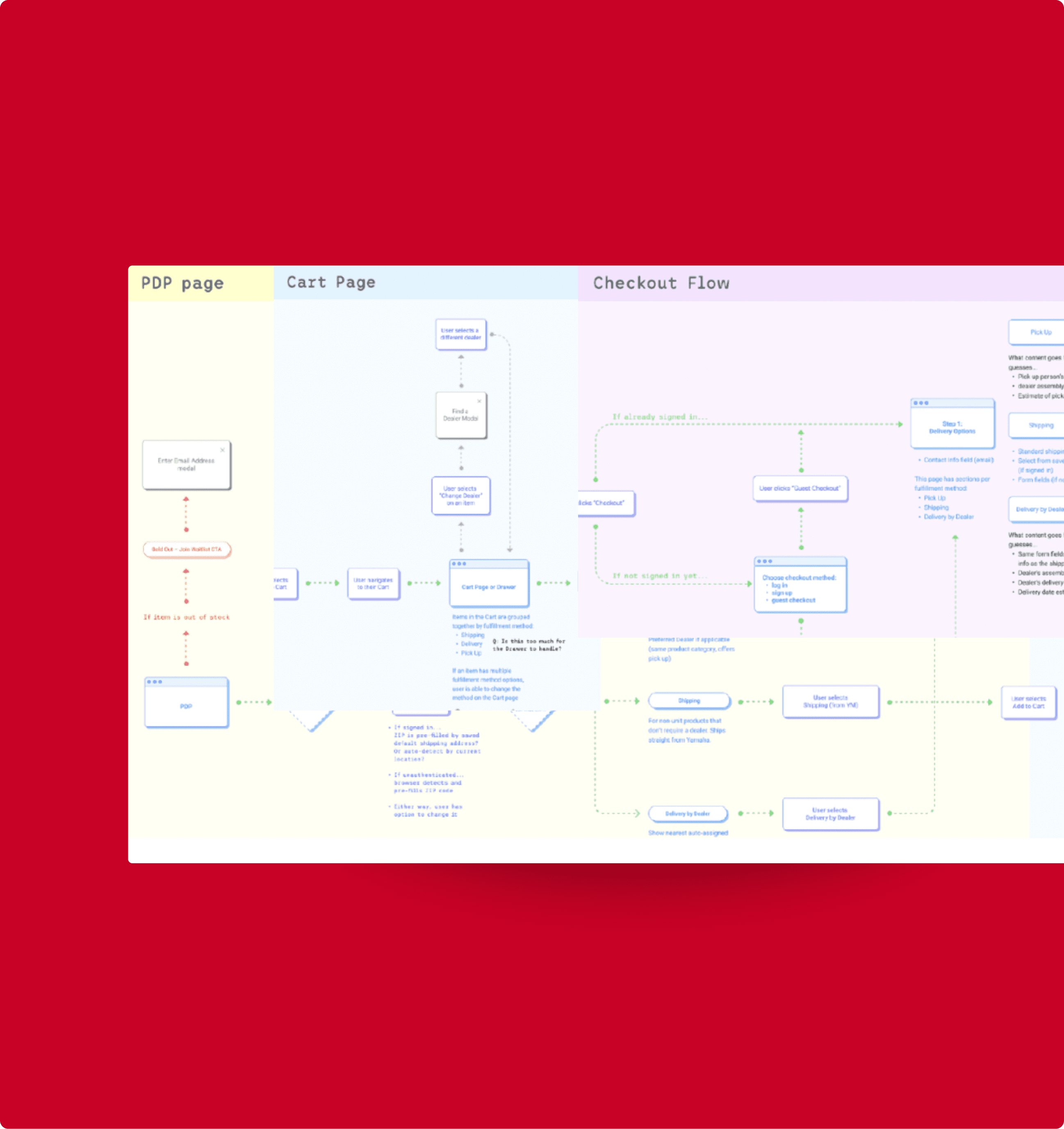
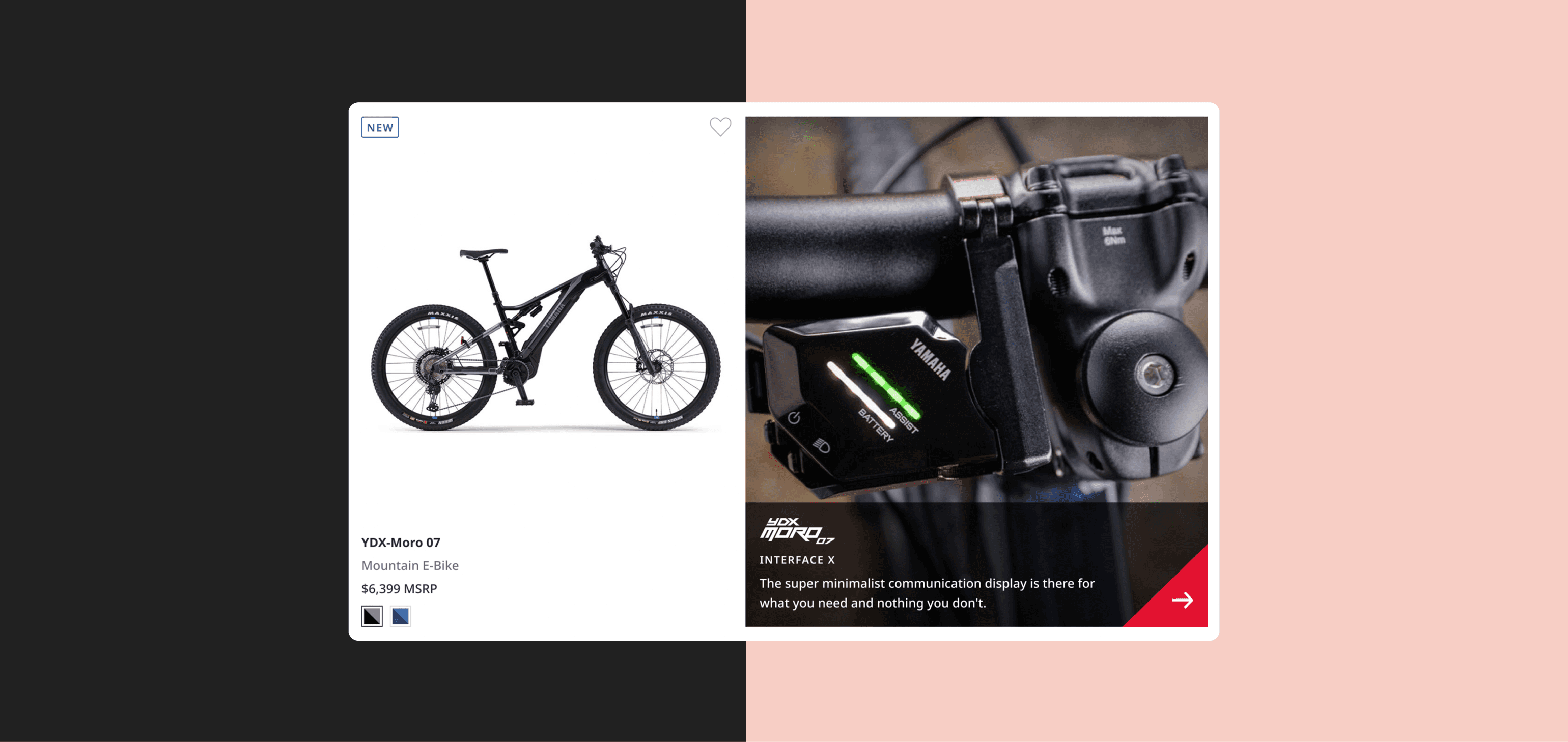
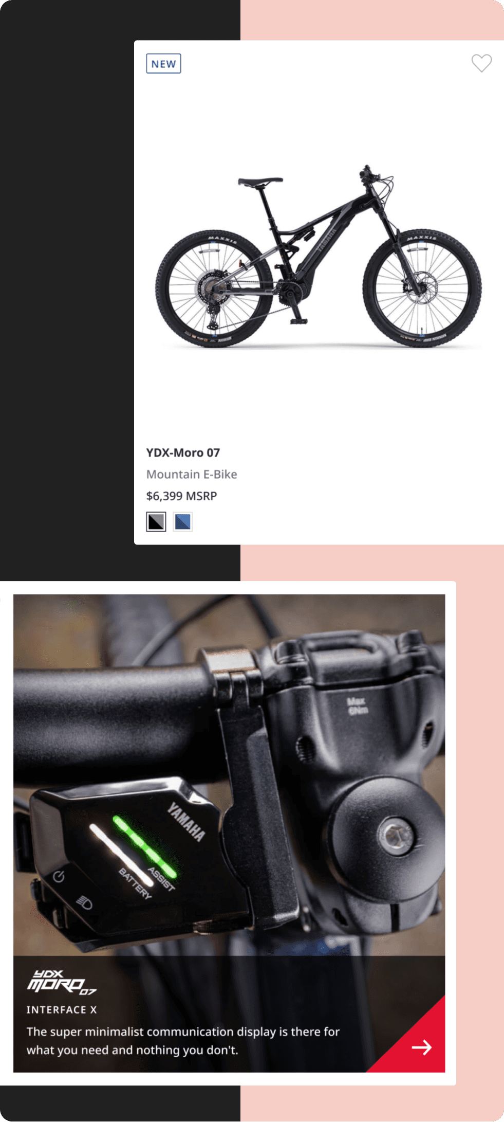
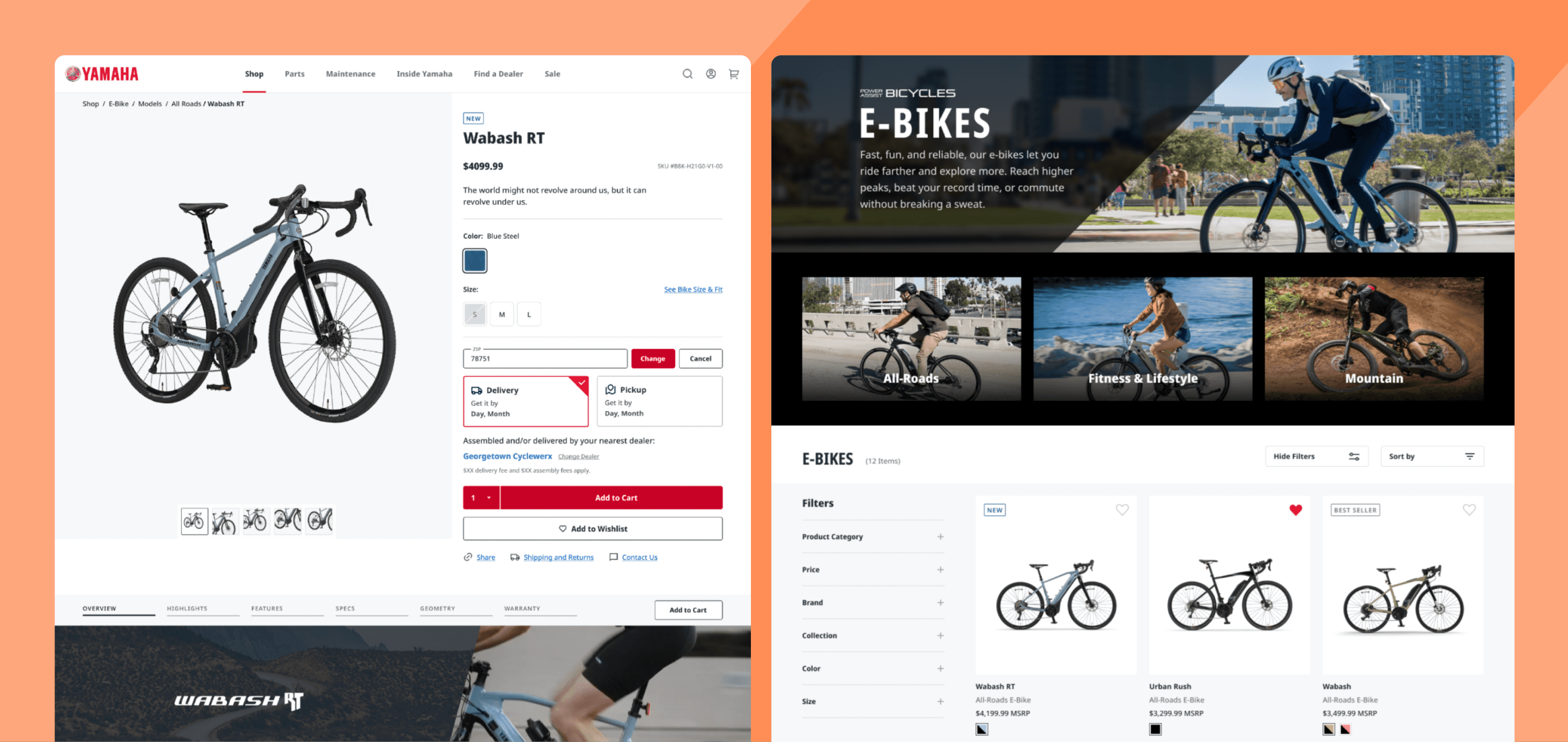
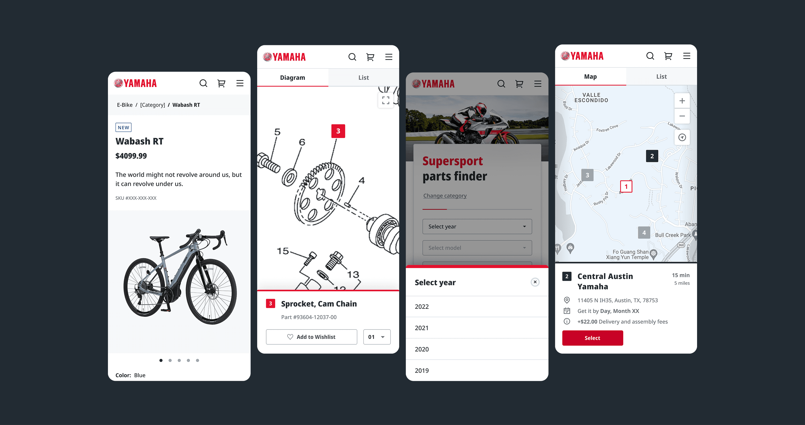
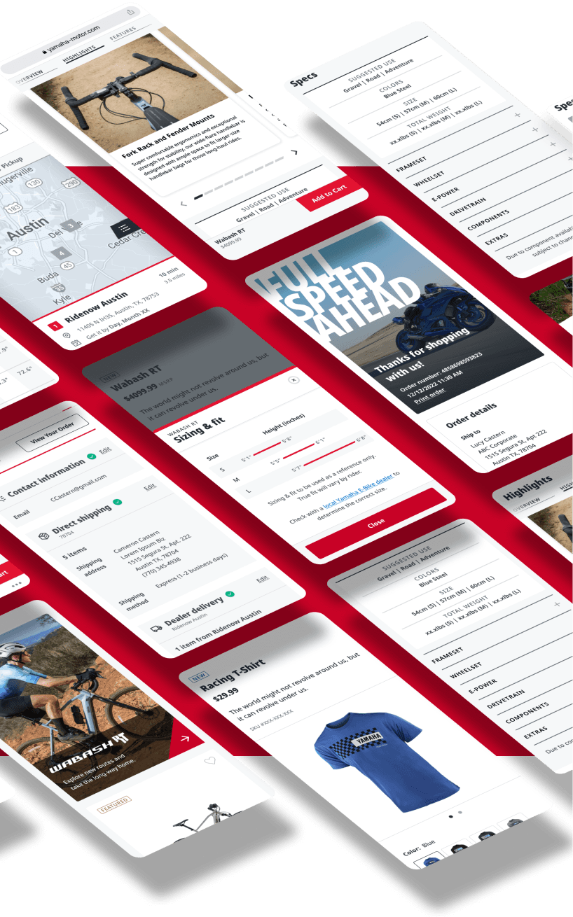
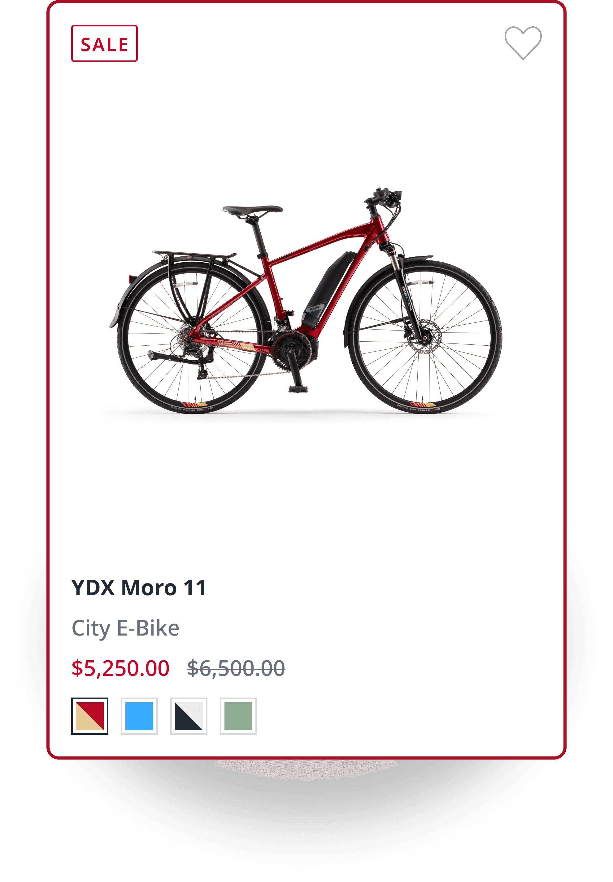
Product & Category Display Pages
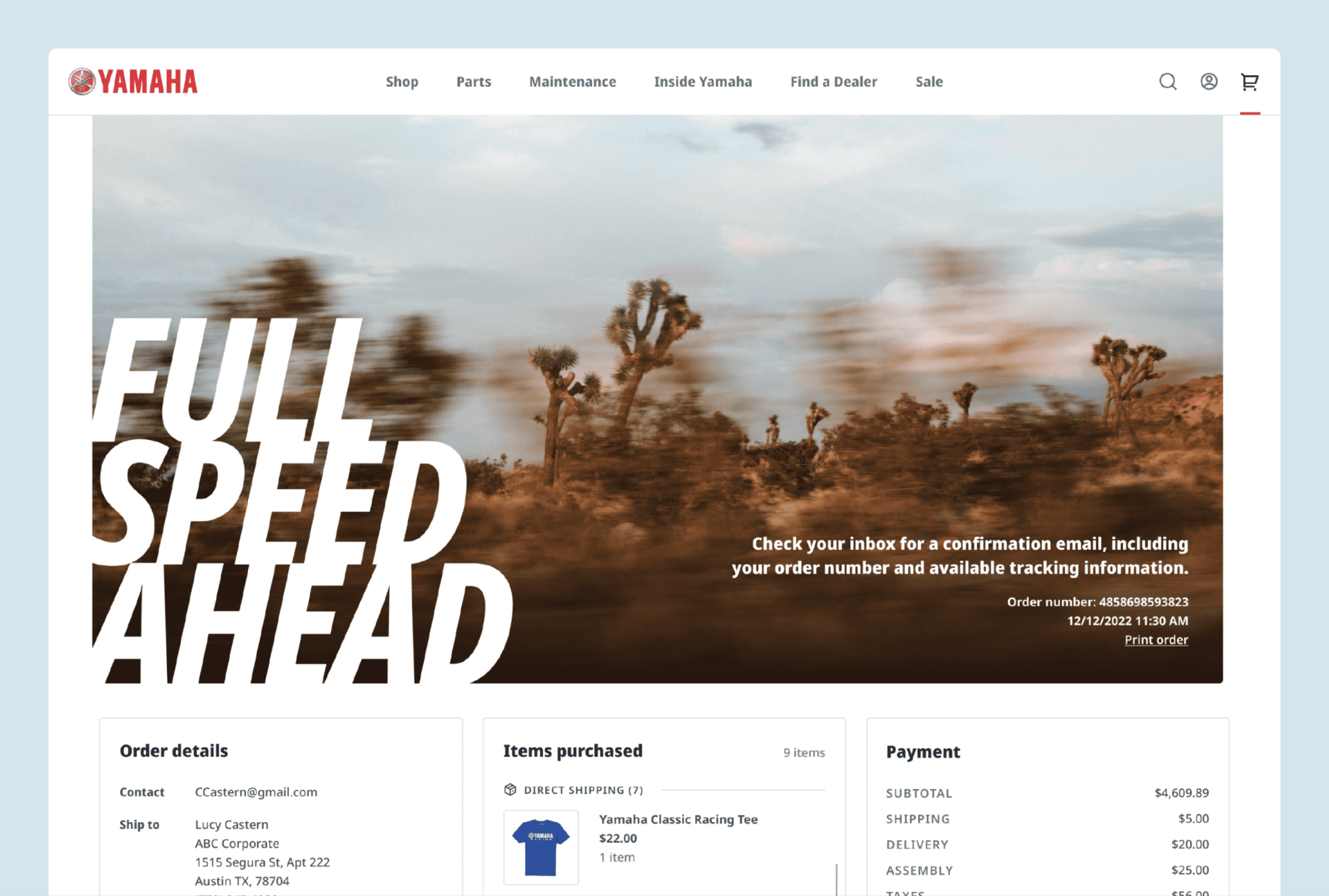
Checkout flow
Dealer Locator
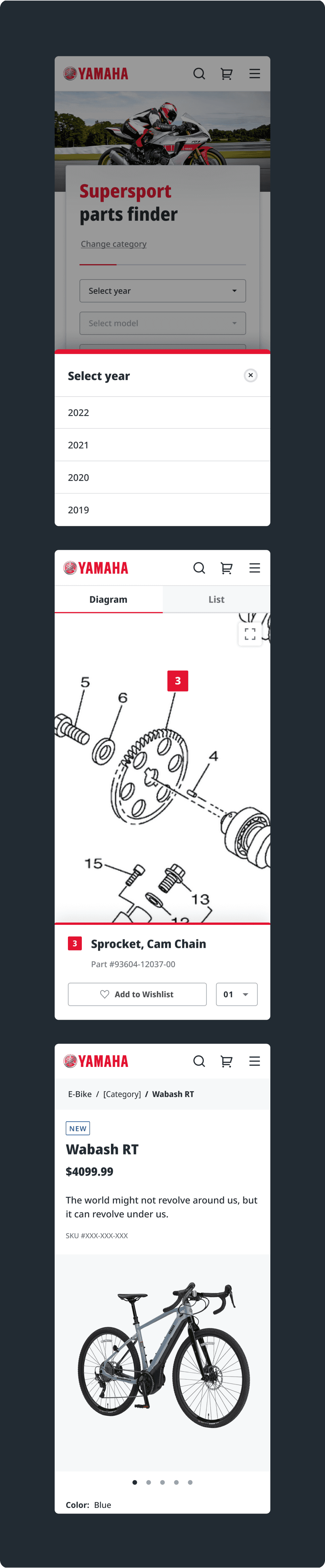
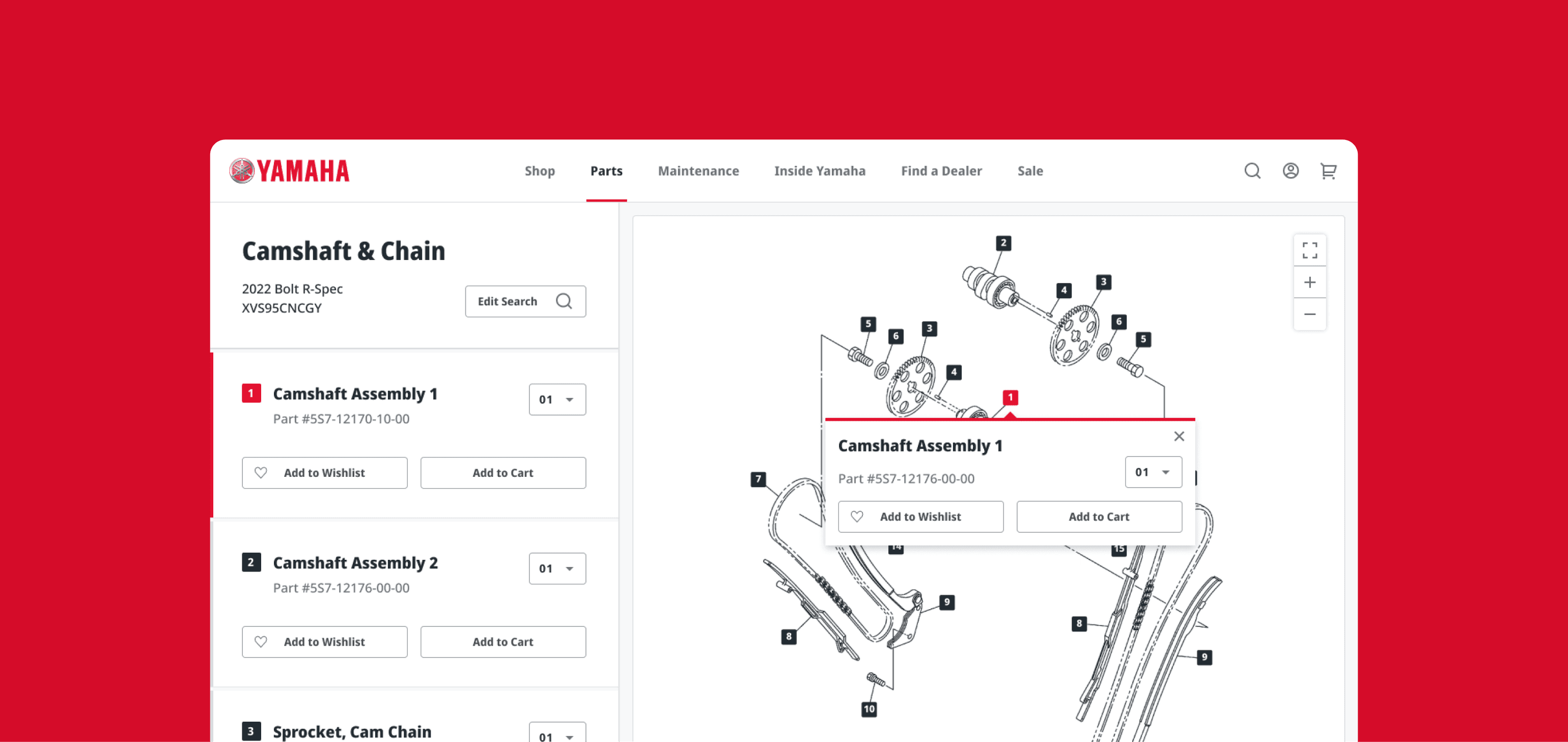
Parts Lookup
MVP E-Commerce launch
Branded moments
Micro interactions
Page animations
Photo library
Owners Center
Full E-Commerce design